WECU

WECU Ferndale bank pylon symmetrical view

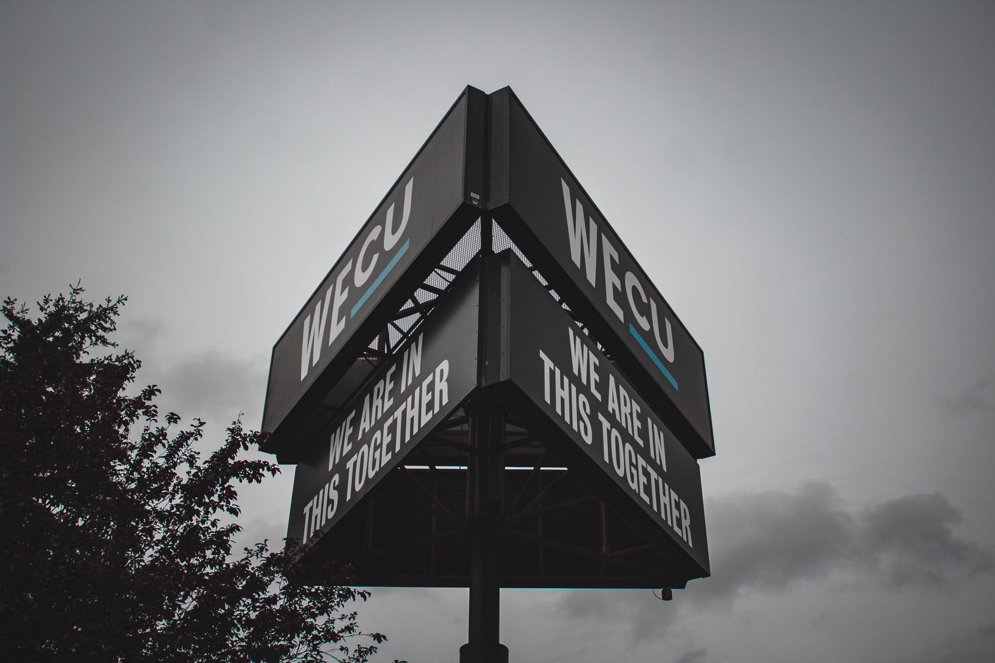
WE ARE IN THIS TOGETHER WECU Bank in Ferndale received a pylon sign update to their sign faces. The sign faces measure 5′-5″ tall by 16′ wide. We applied their new slogan with white vinyl lettering onto the black composite panels. This pylon is high enough that it can be seen from the freeway as

Pacifica Medicine & Wellness

Pacifica Medicine & Wellness sandblasting cedar planks

Sandblasted Custom double-sided, clear western red cedar, sandblasted sign. This project showcases a traditional way of sign making, using real wood and sandblasting out the letters and logo. Having a wood sign is a direct pathway to producing a classic look for your business.

Vaughn Hagen CPA

Sarah Trefethen closeup of sandblasted raw wood

Real Wood. Real Good. Custom double-sided, sandblasted, sign panel for Vaughn Hagen & Sarah Trefethen Public Accountants. The sign panel measures 18” tall by 4’-7” long by 1 ½” thick.

Fairfield Park

Fairfield Park left to right view of sandblasted wayfinding sign

Fairfield Mobile Home Park Fairfield Park’s wayfinding monument sign is double-sided, multiple layered, sandblasted, and non-illuminated. It measures 6’-0” tall by 7’-0” long. The sign panel is 1 ½” thick cedar blank that is blasted out around the letters, oval & round. The sign is mounted between two 6” x 6” treated posts that are

Super Bear IGA

Supercharged Signage What a difference refreshing the signage of a business can do for the impression and feeling customers have when they enter the building. Customers would frequently comment their relief of having new signs go up. It really causes stress when there is a lack of labeling and directions to where something is. The

Peoples Bank

Be Seen and Take Control of Your Image. Every signage project presents itself with different challenges and obstacles for the installation and design team. Peoples Bank in Barkley Village is an excellent example. They were in need of upgrading their massive channel letter sign, however, poles on the outside of the building required the sign

Skagit Regional Health

Skagit Regional Health wayfinding monument sign

Aesthetically Informational The signage package for Skagit Regional Health needed to improve their look as well as guide the patients and visitors to their desired destination. All while maintaining a cohesive feeling throughout each department. We were able to differentiate each department through the use of subtle design choices. For example, the variety of colored

Bellingham Technical College

Know Where You Are Going A college campus can be difficult to navigate if you haven’t been before. Having visual navigation systems in central locations of the campus makes the life of staff, visitors, and students less stressful. Wayfinding signage is one of the first ways you attempt to figure out where something is. Old

Bellingham Public Schools – Good Food

Bellingham Public Schools closeup of digital graphic sign

Good Food. Great Signage. The signage package for Bellingham Public Schools central kitchen and warehouse included identifying and wayfinding signs. The building sign is routed with composite aluminum letters and painted with an acrylic polyurethane satin finish. The wayfinding signs are also composite aluminum with full-color digital print graphics and UV laminate mounted to 3”