Peoples Bank

Be Seen and Take Control of Your Image. Every signage project presents itself with different challenges and obstacles for the installation and design team. Peoples Bank in Barkley Village is an excellent example. They were in need of upgrading their massive channel letter sign, however, poles on the outside of the building required the sign

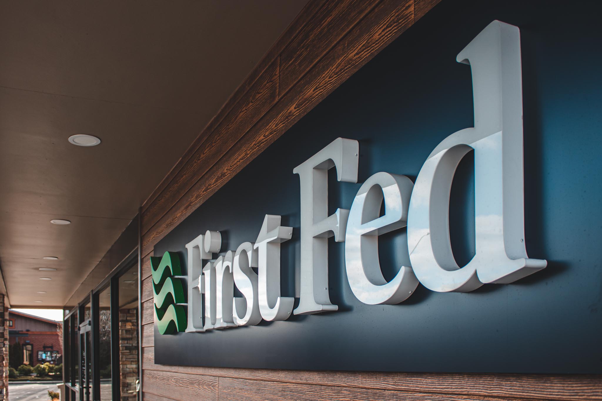
First Federal

Front of Mind. Front in Center. Using signage correctly increases the control of how your business is perceived. The signage package for First Federal in Ferndale uses thoughtful sign design, easy-to-find, and sophisticated branding. When businesses give considerate attention to their building it nonverbally communicates to patrons the standards of their company. Impossible to Forget

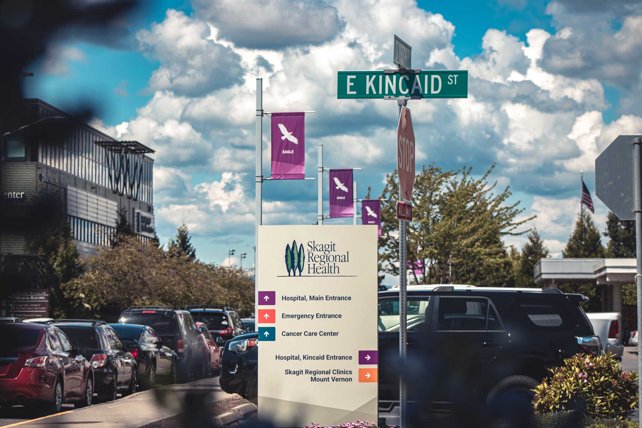
Skagit Regional Health

Skagit Regional Health wayfinding monument sign

Aesthetically Informational The signage package for Skagit Regional Health needed to improve their look as well as guide the patients and visitors to their desired destination. All while maintaining a cohesive feeling throughout each department. We were able to differentiate each department through the use of subtle design choices. For example, the variety of colored

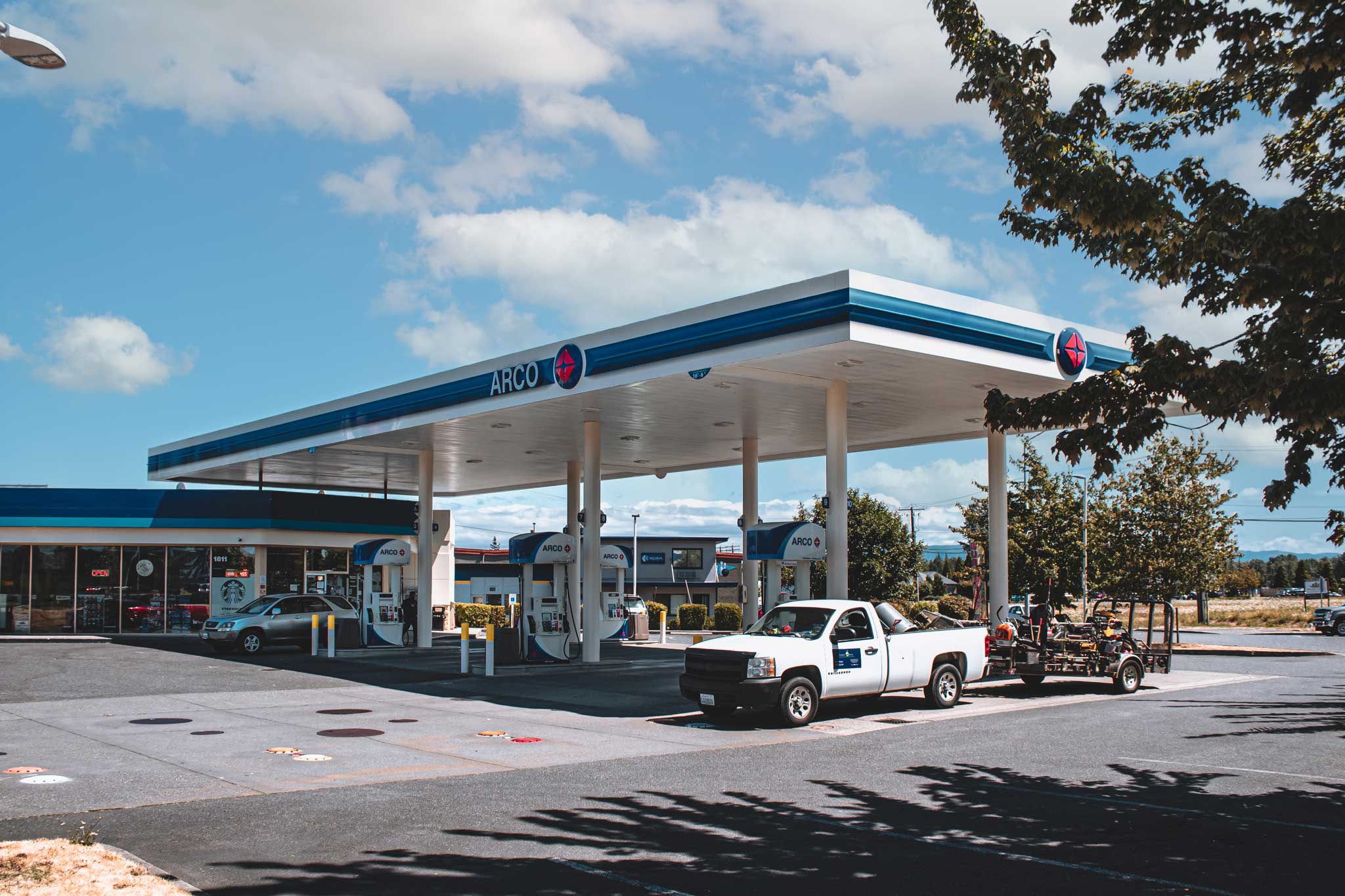
Arco

Ferndale Arco gas station canopy

Brand Awareness is Key. Imagine being on a lengthy road trip and you need to refuel and stretch your legs, why do you choose to stop where you do? Several reasons might make you pull over, for example, convenience, urgency, comfort, etc. Most people will stop because of familiarity. When we do gas station conversions

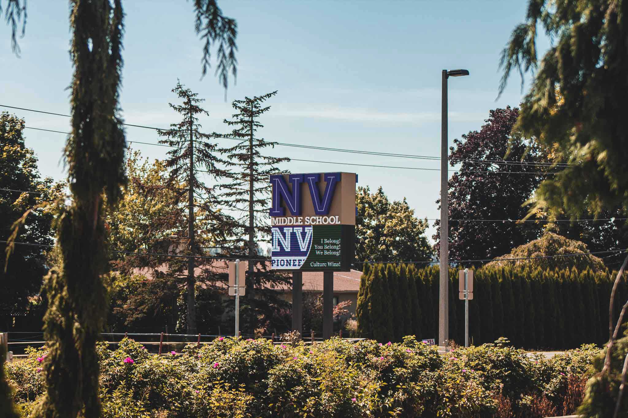
Nooksack Valley Middle School

Nooksack Valley Middle School digital pylon sign

Intelligent Identifiers Nooksack Valley Middle School‘s main identifying sign greets and serves as a wayfinder for approaching students, parents, and teachers. It is a 20-foot freestanding pylon sign paired with an electronic message center. The beauty of digital signage is that the content can be updated as the season changes. Not all the digital messages

Darrington IGA

Darrington IGA illuminated channel letters

Reinvigorating the IGA Brand Darrington IGA is a supermarket located in the foothills of the magnificent Cascade Mountains. The IGA brand experienced an overhaul of their look and feel, rebranded by Interbrand. To make Darrington’s signage unique we included a circular logo element featuring a graphic style illustration of the Cascade Mountains. Quirks with a

Swire Coca-Cola

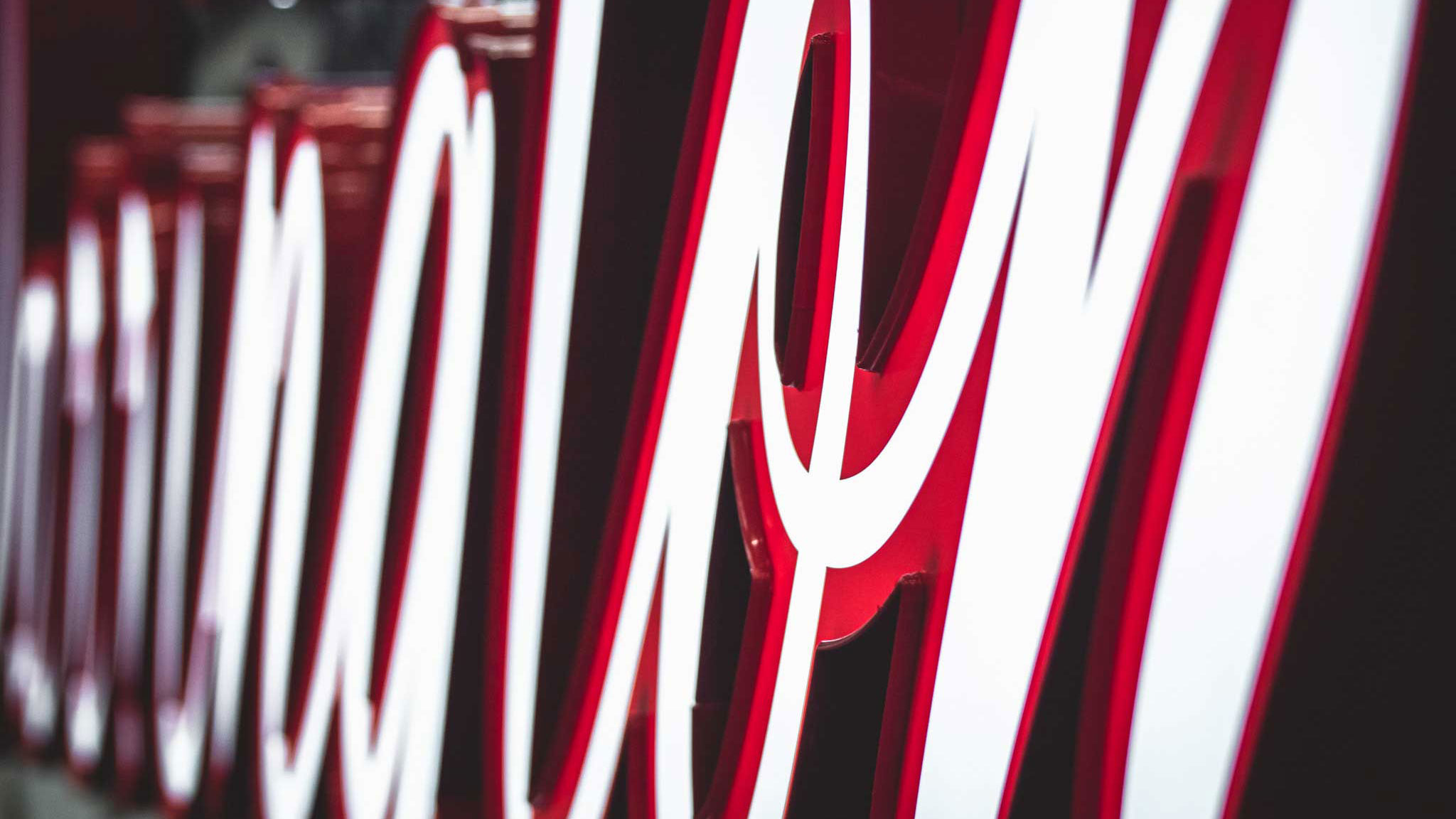
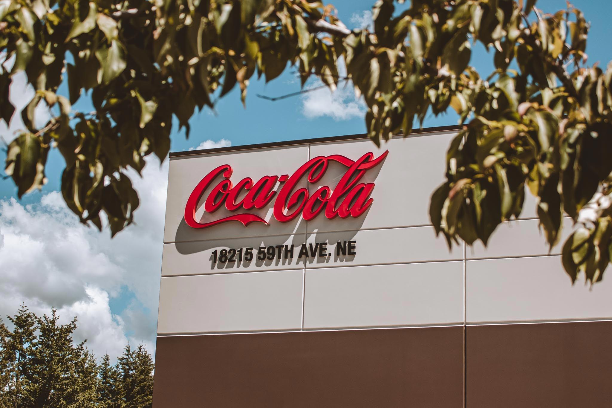
Swire Coca-Cola channel Letter building sign

Happiness in a Sign Coca-Cola is one of the most recognizable brands in the world and it isn’t by chance. Their iconic font paired with bold red is a timeless design. Coca-Cola’s marketing is a priority to them. It helps spread their image and brand story out to the people that care. The signage package

Whatcom Humane Society Thrift

Whatcom Humane Society Thrift Shop ultra closeup of channel letters

Get Thrifty With It! Whatcom Humane society opened a Thrift Store and we fabricated and installed their entire sign package. Thrift stores are great if you have old items that no longer serve you and may be valuable to others. Signs You Need When Opening a New Business 1. Exterior Entry Sign: This is the

Care Medical Group

Care Medical Group right to left view of reflective channel letter sign

Channeling Progression When challenges arise, imaginative solutions are required. The sign code for Care Medical Group was fairly restrictive in terms of the allowable square footage for the sign. To best maximize the scale of the channel letter sign we used metallic silver returns to catch light from the sun. As well as translucent digitally