Pacifica Medicine & Wellness

Pacifica Medicine & Wellness sandblasting cedar planks

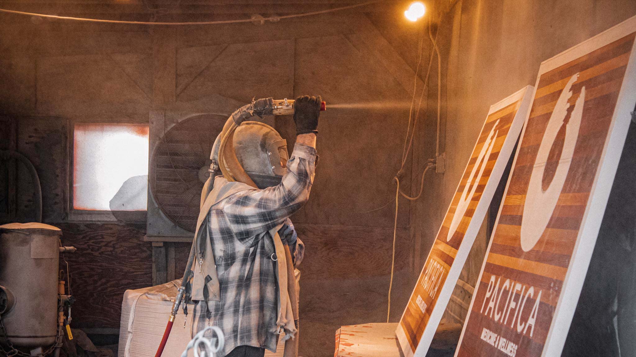
Sandblasted Custom double-sided, clear western red cedar, sandblasted sign. This project showcases a traditional way of sign making, using real wood and sandblasting out the letters and logo. Having a wood sign is a direct pathway to producing a classic look for your business.

PeaceHealth Fairhaven Plaza Clinic

PeaceHealth Fairhaven Plaza Clinic side view of push-through acrylic letters

Cared for and Welcomed When going in for a medical visit don’t you want to feel taken care of? Clean, coherent, and comforting signage for medical offices is vital. When designing the signage for PeaceHealth Fairhaven we aimed for simplicity while remaining informational. As well as being consistent with PeaceHealth’s branding, visibly known for their

Skagit Regional Health

Skagit Regional Health wayfinding monument sign

Aesthetically Informational The signage package for Skagit Regional Health needed to improve their look as well as guide the patients and visitors to their desired destination. All while maintaining a cohesive feeling throughout each department. We were able to differentiate each department through the use of subtle design choices. For example, the variety of colored

Bellingham Bay Ophthalmology

Bellingham Bay Ophthalmology closeup of dimensional letters

I Can See Clearly Now The intention behind the signage for Bellingham Bay Ophthalmology was to be professional and noticeable. The entry cabinet sign was made with different levels of dimension and internal illumination to really make it pop during the evening. The main lettering is raised dimensional lettering that has back-lit lighting. The sub-heading

Care Medical Group

Care Medical Group right to left view of reflective channel letter sign

Channeling Progression When challenges arise, imaginative solutions are required. The sign code for Care Medical Group was fairly restrictive in terms of the allowable square footage for the sign. To best maximize the scale of the channel letter sign we used metallic silver returns to catch light from the sun. As well as translucent digitally

Core Physio

View of Kansas st. and Grant St. Core Physio pylon sign

You Don’t Have to Reinvent the Wheel When coming up with Core Physio’s pole sign design, we played around with the idea of reusing the former Stampadoodle angled pole. The Stampadoodle also reused the same pole and sign cabinet originally from Skipper’s Seafood N’ Chowder. If you spot one of these angled pole signs in