First Federal

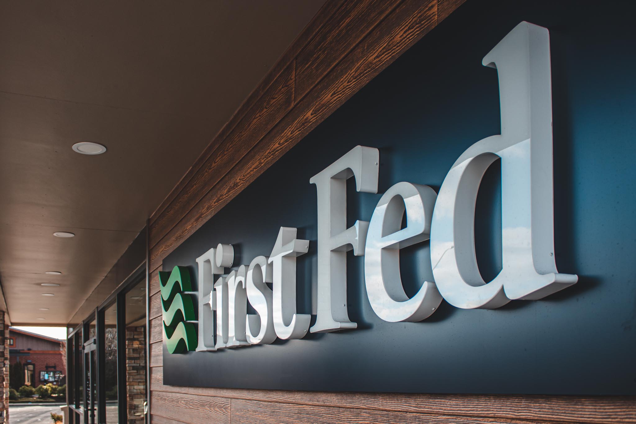
Front of Mind. Front in Center. Using signage correctly increases the control of how your business is perceived. The signage package for First Federal in Ferndale uses thoughtful sign design, easy-to-find, and sophisticated branding. When businesses give considerate attention to their building it nonverbally communicates to patrons the standards of their company. Impossible to Forget

PeaceHealth Fairhaven Plaza Clinic

PeaceHealth Fairhaven Plaza Clinic side view of push-through acrylic letters

Cared for and Welcomed When going in for a medical visit don’t you want to feel taken care of? Clean, coherent, and comforting signage for medical offices is vital. When designing the signage for PeaceHealth Fairhaven we aimed for simplicity while remaining informational. As well as being consistent with PeaceHealth’s branding, visibly known for their

Scotty Browns

Social Metamorphosis Scotty Brown’s restaurant, lounge, and social house moved into a brand new construction building and called on us to add to the ambiance of their new space. Signage sets the standard and mood for any business. It can make or break the customer experience. Elevate or frustrate. Great Design is Subtle The signage

Bellingham Bay Ophthalmology

Bellingham Bay Ophthalmology closeup of dimensional letters

I Can See Clearly Now The intention behind the signage for Bellingham Bay Ophthalmology was to be professional and noticeable. The entry cabinet sign was made with different levels of dimension and internal illumination to really make it pop during the evening. The main lettering is raised dimensional lettering that has back-lit lighting. The sub-heading

Bank of the Pacific

Keep it Balanced. Location, location, location. Bank of the Pacific in Burlington is located right off the freeway and being able to be found is essential for patrons. Bank of the Pacific is on a corner and it is easily identifiable when driving by. Their consistent signage throughout their branches helps boost their recognition even