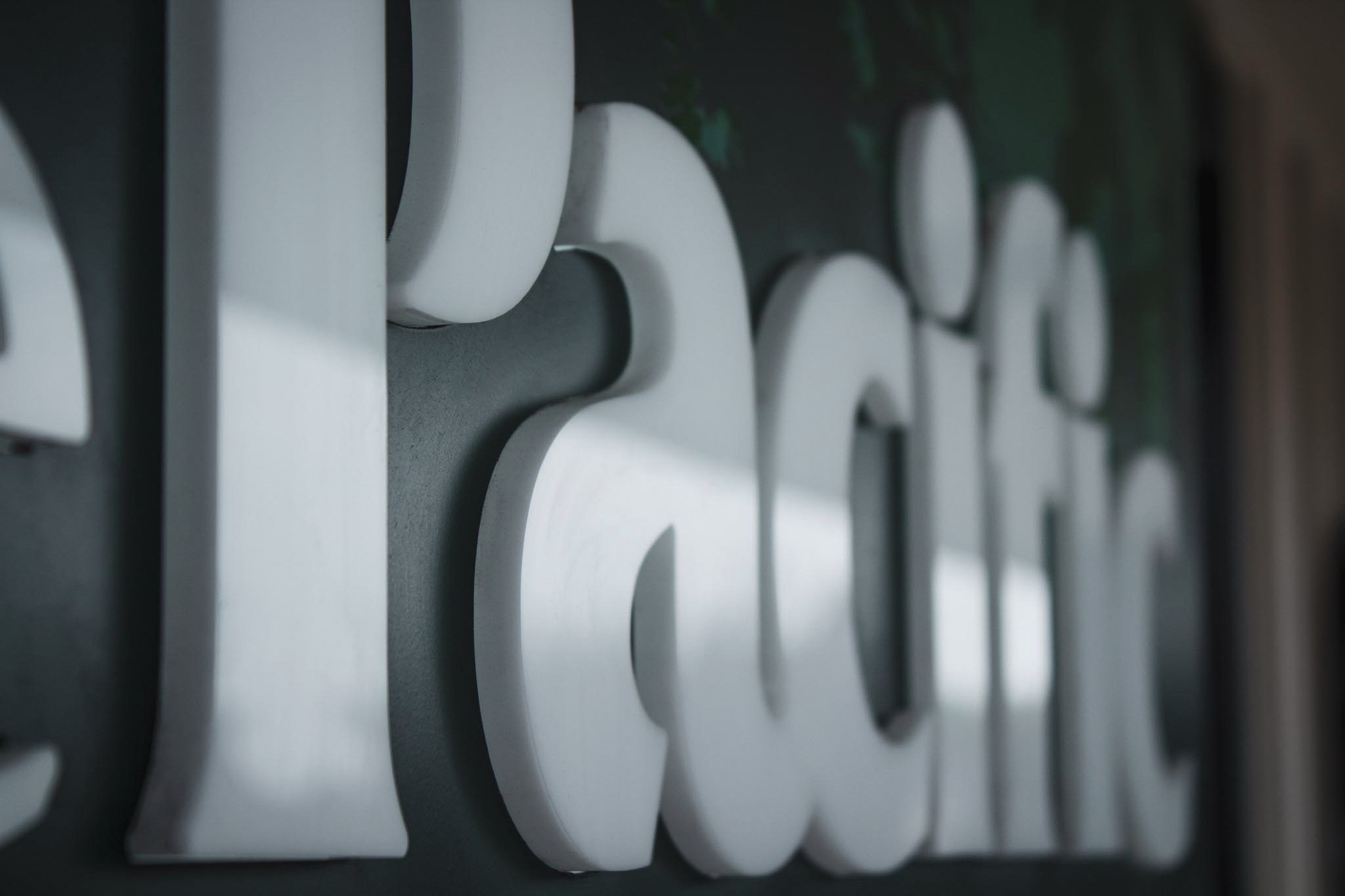
Ride Culture

Ride Culture closeup of illuminated neon sign "kindness"

Creating a Culture of Kindness Ride Culture is an indoor cycling community with an amazing facility. Their ride room is fashioned with RGB lights to match or change the mood of the music. Mood Setter We assisted Ride Culture in creating an incredible atmosphere for their riders and team by fabricating a custom neon sign …
Care Medical Group

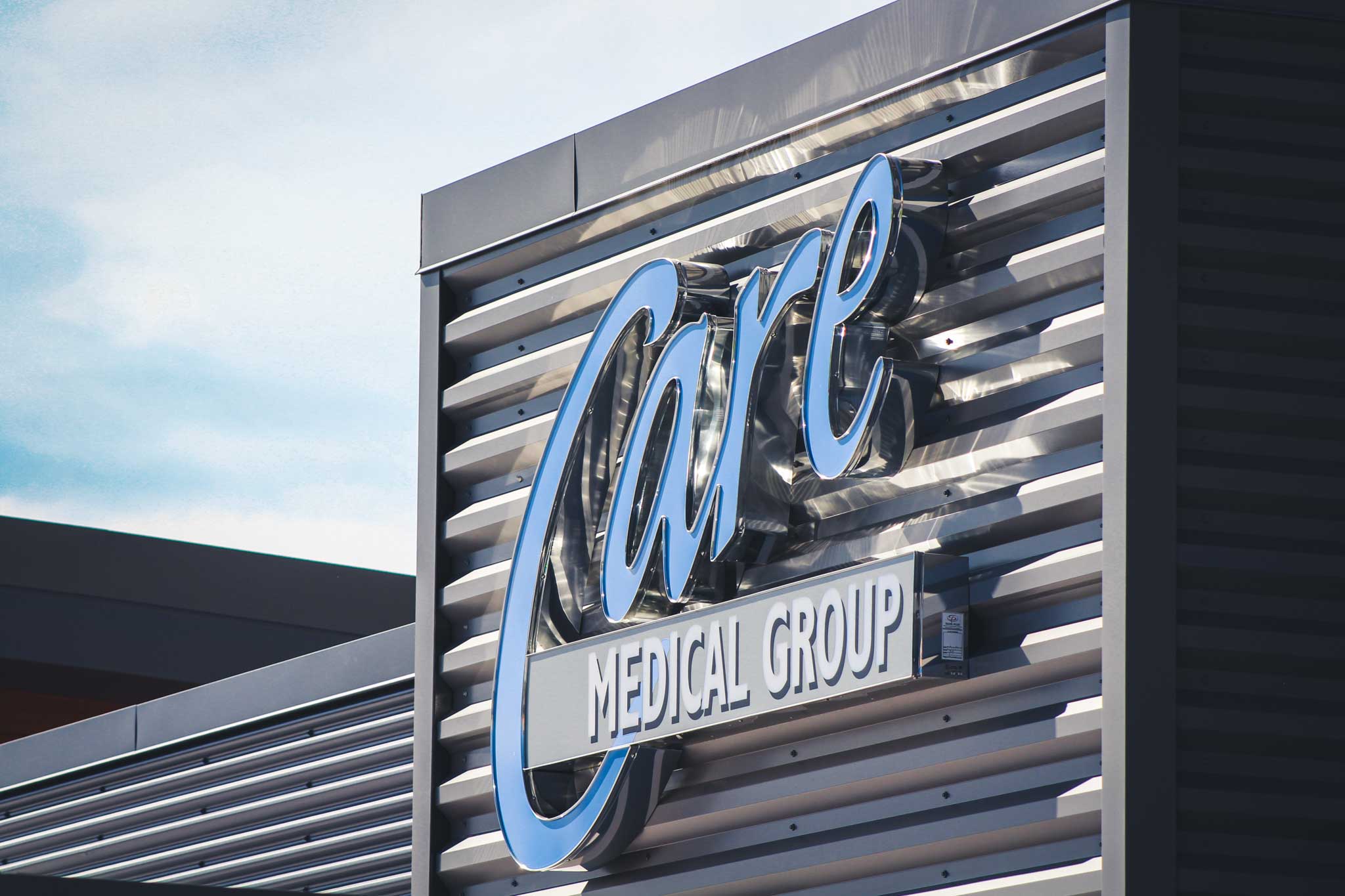
Care Medical Group right to left view of reflective channel letter sign

Channeling Progression When challenges arise, imaginative solutions are required. The sign code for Care Medical Group was fairly restrictive in terms of the allowable square footage for the sign. To best maximize the scale of the channel letter sign we used metallic silver returns to catch light from the sun. As well as translucent digitally …

Core Physio

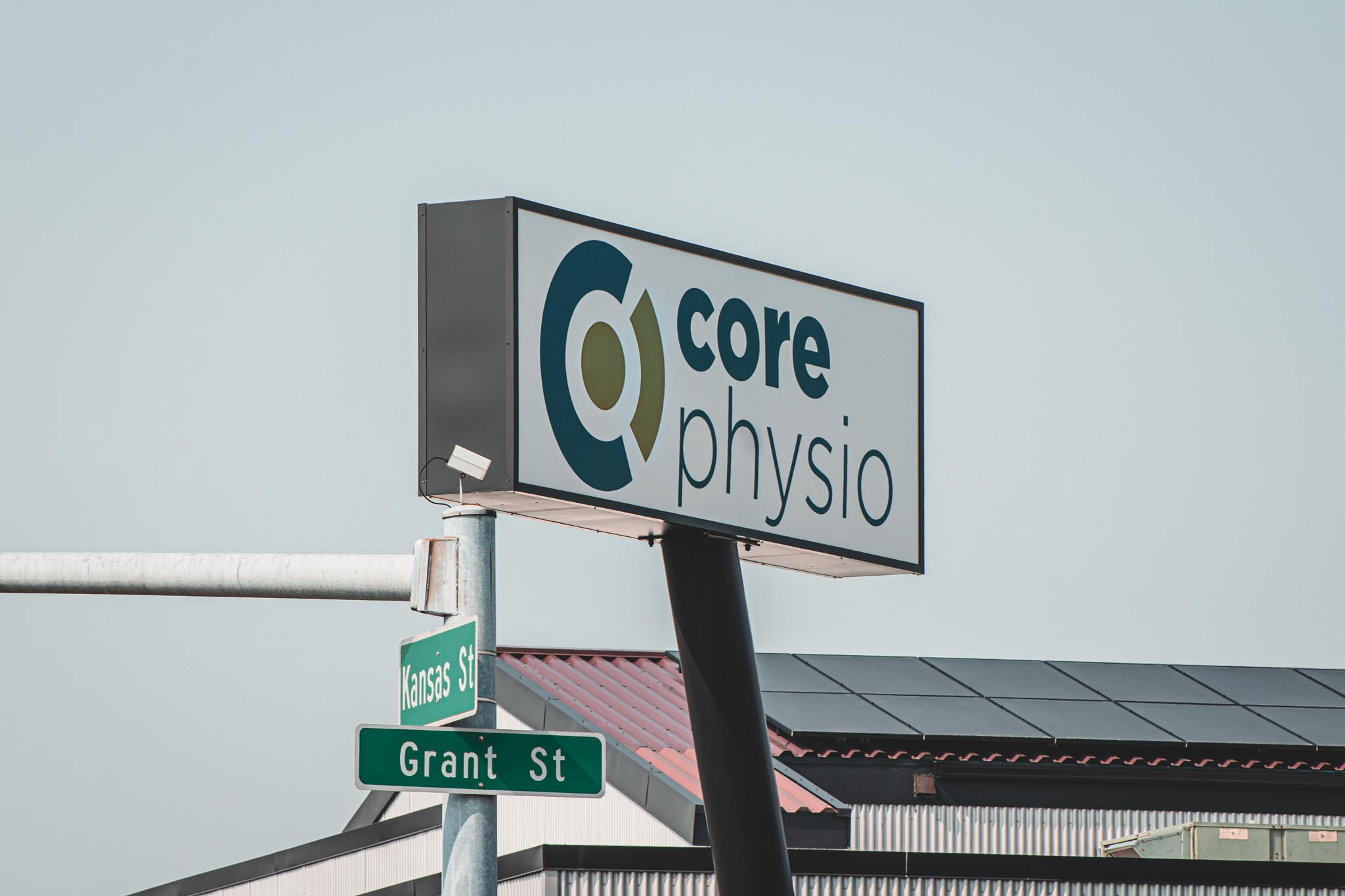
View of Kansas st. and Grant St. Core Physio pylon sign

You Don’t Have to Reinvent the Wheel When coming up with Core Physio’s pole sign design, we played around with the idea of reusing the former Stampadoodle angled pole. The Stampadoodle also reused the same pole and sign cabinet originally from Skipper’s Seafood N’ Chowder. If you spot one of these angled pole signs in …

Community Food Co-op

Community Food Co-op wayfinding monument sign

All for One The Community Food Co-op is known as Bellingham’s natural grocer and dates back to 1969. In order to honor their heritage in the shape of signage, we used their bold bright colors and incorporated free-flowing leaf shapes. We also repeated shapes found in the exterior wayfinding monument sign all throughout the signs …

Nugents Corner Market

Judge this book by its cover Nugents Corner Market is a family-owned grocery store that filled the demand of everyone living in the area. They care about providing the best quality for their customers. The best quality in ingredients and in their brand appearance. It is crucial to not overlook the signage component when opening …

Bank of the Pacific

Keep it Balanced. Location, location, location. Bank of the Pacific in Burlington is located right off the freeway and being able to be found is essential for patrons. Bank of the Pacific is on a corner and it is easily identifiable when driving by. Their consistent signage throughout their branches helps boost their recognition even …

Barron Heating & Air Conditioning

Barron Heating worms-eye view of channel letter sign

Coming in Hot…and Cold. One of Barron Heating’s core values is being trustworthy. Businesses with clean, professionally-built, signs communicate to their customers that they are credible and instill confidence. In order to convey trust through signage, we knew the branding had to be consistent across all the services that Barron provides. The Power of Simple …

Lummi Indian Tribe Salish Village

Salish Village dimensional face and electronic diesel price sign

Relocated, Revamped, and Ready to Roll! Lummi Bay Market located off exit 260 pumps more than just fuel. They are a mega convenience store, truck stop, gas station, serve fresh-made foods, and the list goes on. To help spread the word and let traffic know what services they offer, visible, clean, bold signage was essential …

20 Bellwether

20 Bellwether dimensional routed out face back-up by acrylic plex

More than Adequate 20 Bellwether is located on the water on the port of Bellingham neighboring a diverse amount of elegant restaurants and businesses. To complement the surrounding environment our goal was to create signage that would enhance the living experience for residents and visitors of the area. “A thing is deemed beautiful only when …